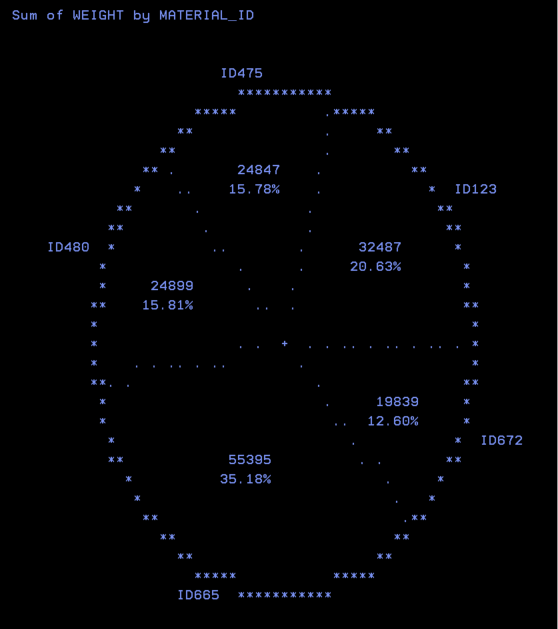
With the proc chart procedure, the PIE statement will create the PIECHART. The size of a pie represents the percentage that of category of data.
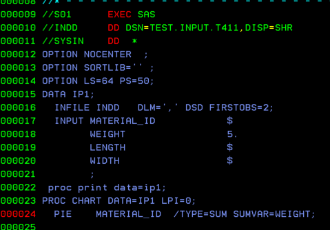
In SAS, you can create a pie chart using PROC CHART with the PIE statement. Each slice of the pie shows the percentage for a category in your data.
When you view the output in the spool, the chart might not look like a perfect circle. By default, it often appears a little stretched or oval-shaped. You can fix this by adjusting values with the LPI statement.
The overall size of the pie is controlled only by two SAS system options: LINESIZE (LS) and PAGESIZE (PS).
LS (Linesize) sets the width.
PS (Pagesize) sets the height.
For now, we’ll just look at how the chart appears in the spool. In practice, pie charts usually look much better when you send them to other output formats, such as HTML, PDF, or other ODS devices.
But for this post we will see how it looks like in the spool. Generally these looks good when routed to other output modes like HTLM, PDF or other devices using ODS.

Leave a comment